- Business Intelligence
- Power BI
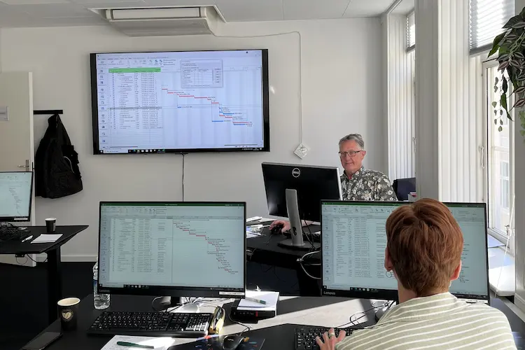
- Designing Reports in Power BI (conducted in English) kursus
You will learn
This Power BI course is designed for those who are going to create user friendly and interactive reports in Power BI. We will learn you how to use Power BI Desktop and take advantage of many Report options.
After the course you will be able to handle these tasks:
- Create reports using data from existing Datamodels (Cubes)
- Design and format Reports and Dashboards - to get a better overview of your data
- Implement filters and interactivity in Reports and Dashboards - so users can search and navigate to needed data.
- Share Reports and Dashboards with others
In the section ”Course content” further down on this page, you can read all about, what will be presented on this Power BI course.
If you´re also going to work with extracting data and build a Datamodel, then instead we will suggest the course: Analyze and visualize data with Power BI.
Please note that this course also exist in a conducted in Danish version: Design af rapporter med Power BI
You get
During the course
- Teaching by the most experienced instructor team in our cozy and fully updated classrooms located in the center of Copenhagen.
- A course that consists of a both theory and practical exercises. We know the importance of having practical exercises and hands-on is always in focus during the courses.
- A course material you can use as an encyclopedia after the course and downloads of course exercises.
- All meals, which includes breakfast, fresh coffee, tea, fruit, soft drinks, lunch in an Italian restaurant, cake, candy and off cause Wi-Fi to your devices.
- A course certificate as a proof of your new skills.
After the course
- Access to our free hotline service, which means that you up to a year after the completing of the course can contact us if you have questions regarding subjects from the course.
- We have a unique satisfaction guarantee in order to ensure you the complete benefit from the course.
Get the best benefit from the course
This Power BI course is a part of 4D's unique collection of English conducted courses and is designed for business analytics, controllers or similar rolles, that wants to start working with Self- Service Business Intelligence.
It is expected that you have tried designing Reports e.g. in Excel.
Course Details
In this module, you are introduced to the tools and services related to Power BI. You are introduced to the local tool Power BI Desktop, where you can develop Reports and Dashboards.
The following will be covered:
- Introduction to Power BI
- Introduction to Power BI Desktop
In this module you are introduced to different types of Datamodels and how to connect to them using Power BI Desktop. You are introduced to the structure in a Star Schema Model and the difference between Fact- and Dimensions tables.
The following will be covered:
- Introduction to Star Schema Model
- Data in relational databases
- Data in a tabular data model
- Measures and calculated columns
- Hierarchies
In this module you will learn how to implement a number of Visuals into a Power BI report. You will learn how to design- and format these Visuals.
The following will be covered:
- Tables, Matrices and Charts
- Plotting geographical data
- Formatting the Visuals
In this module you will learn some basic principles when designing reports. You’ll learn to use the correct Visuals when presenting certain key values. You will also learn how to create- and use themes, to secure a standardised design of your reports but also more time effective. Designing the report pages for mobile views are also presented.
The following will be covered:
- Good principles for report/dashboard design
- Page formatting
- Themes
- Mobile Layout
In this module you will learn how to use conditional formatting in visuals, making the format more dynamic, so users easily can focus on the most important key values and quickly identify deviations. You will learn how to add additional analytic lines to the visuals e.g. averages and percentiles.
The following will be covered:
- Small Multiples
- Sparklines
- Analytics lines
- Conditional formatting
In this module you will learn how to use more specialised visuals, amongst other Q&A, giving the option of querying data without having to build advanced DAX expressions. You will also learn how to import and use some of the many visuals from Microsoft AppSource.
The following will be covered:
- Visuals from AppSource
- Score Cards
- Smart Narrative
- Q & A
In this module you will learn how to use the filters panel and slicers in reports, so end users can select the data to focus on. You will learn to implement filters on different levels and how to synchronise slicers cross different report pages.
The following will be covered:
- Filters between visuals
- Background filters
- Slicers
- Synchronising slicers between pages
In this module you will learn how to implement different types of interactivities in the report. You will learn how to create page tooltips and drill-through. It is presented how to design reports with multiple pages and navigate through these pages e.g. by using buttons.
The following will be covered:
- Tooltips and page tooltips
- Hierarchies and drill-down
- Drill-through
In this module you will learn how to implement bookmarks in a report with more advanced interactivity e.g. using menus for changing between certain data or visuals on a page.
The following will be covered:
- Introduction to bookmarks
- Creating and updating bookmarks
- Interactivity with bookmarks
Vælg dato, by og deltagere
19-08-2026
Kl: 09:00-16:00
Hvad siger vores kunder om os?
Siden 1991 har 4D Academy hjulpet virksomheder og specialister med at omsætte viden til målbare resultater. Vores kursister belønner os med en gennemsnitlig rating på 4,8 ud af 5 på Trustpilot, Google og Facebook, og det gør os stolte.
Se hvorfor både nye og erfarne fagfolk vælger os, når de vil løfte deres kompetencer.


Hold dig opdateret med vores nyhedsbrev
Her bor vi
Læderstræde 22, 2. sal, 1201 København K
Tueager 5, 8200 Aarhus
Ørbækvej 350, 5220 Odense
Tirsdag: 08.00 - 16.00
Onsdag: 08.00 - 16.00
Torsdag: 08.00 - 16.00
Fredag: 08.00 - 16.00